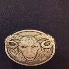
The new tough looking Ram just doesn't fit us.rhodyrudder wrote: ↑2 years agoWtf r u talking about?PeterRamTime wrote: ↑2 years agoYes what I was saying! Looks like every Ram logo ever except our unique one!Rhodymob05 wrote: ↑2 years ago I just did a quick internet search of "ram logos" and I hate our new one even more. And its already slapped on shirts and cups and stickers, I guess there's no turning back now. F*ck,
The old one is perfect for its uniqueness and because the "Rams" aspect of our name is the least important. We as fans never say "dang the Rams need a new coach etc" Rams is not a prominent aspect of our identity. That's why the abstract Ram was so right for us.
We are more so Rhody than we are the Rams.
Like there's no deep meaning to the fact that we're called the Rams. We just use it because it starts with an R so we made it our nickname.
It's just not a prominent aspect of our identity
That's why we haven't even used a Ram logo for a decade. We are more connected to being called Rhode Island or Rhody.
So as a secondary logo the old Ram just works better as a less tough guy looking Ram. Idk.