
Logo


-
Rhodymob05
- Tyson Wheeler
- Posts: 7464
- Joined: 11 years ago
- Location: Rhode Island
- x 4025
Re: Logo
I've mentioned this for years that we need horns. A combination of the "RI" and ram would be preferable. VCU's logo is great precedence. Even now, I see our logo next to opponents logo's and it feels and looks like a cookie cutter shape. Colors are fantastic though.
GO RAMS
-
RhowdyRam02
- Frank Keaney
- Posts: 10383
- Joined: 11 years ago
- x 6651
Re: Logo
So the other thread reminded me of this idea for redoing the logo. I think if the horn was rotated a little bit so top of the R was just the horn I'd think you'd have a winner. You'd have the RI so we'd be instantly distinguishable from other teams with a ram mascot, and the old ram logo would live on in the newest logo.Rhodymob05 wrote:Messed around with the current logo and the former ram logo, something I hope to see one day.
ram logo.jpg
I would also have the I the same color as the bottom half of the R so that only the horn would be lighter blue, making it easier to tell that you're creating a horn design with the top of the R
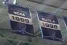
Take down the Robert Carothers banner and fix the concession stand lines
-
RF1

- Ernie Calverley
- Posts: 9154
- Joined: 11 years ago
- x 5557
Re: Logo
I want the RI and words RHODE ISLAND used more. It will better tie the URI athletics programs to the state and its residents. Think MICHIGAN. They hardly ever use the wolverine or the school's official name (University of Michigan). It is usually just MICHIGAN.
-
RhowdyRam02
- Frank Keaney
- Posts: 10383
- Joined: 11 years ago
- x 6651
Re: Logo
Rhodymob05, I'm not sure if you still have this design, unfortunately it no longer shows up in this thread, but this was what I was getting at in the anchor branding threadRhowdyRam02 wrote: ↑6 years agoSo the other thread reminded me of this idea for redoing the logo. I think if the horn was rotated a little bit so top of the R was just the horn I'd think you'd have a winner. You'd have the RI so we'd be instantly distinguishable from other teams with a ram mascot, and the old ram logo would live on in the newest logo.Rhodymob05 wrote:Messed around with the current logo and the former ram logo, something I hope to see one day.
ram logo.jpg
I would also have the I the same color as the bottom half of the R so that only the horn would be lighter blue, making it easier to tell that you're creating a horn design with the top of the R
Take down the Robert Carothers banner and fix the concession stand lines
-
Rhodymob05
- Tyson Wheeler
- Posts: 7464
- Joined: 11 years ago
- Location: Rhode Island
- x 4025
Re: Logo
I'll try to find it.RhowdyRam02 wrote: ↑5 years agoRhodymob05, I'm not sure if you still have this design, unfortunately it no longer shows up in this thread, but this was what I was getting at in the anchor branding threadRhowdyRam02 wrote: ↑6 years agoSo the other thread reminded me of this idea for redoing the logo. I think if the horn was rotated a little bit so top of the R was just the horn I'd think you'd have a winner. You'd have the RI so we'd be instantly distinguishable from other teams with a ram mascot, and the old ram logo would live on in the newest logo.Rhodymob05 wrote:Messed around with the current logo and the former ram logo, something I hope to see one day.
ram logo.jpg
I would also have the I the same color as the bottom half of the R so that only the horn would be lighter blue, making it easier to tell that you're creating a horn design with the top of the R
GO RAMS
-
Rhodymob05
- Tyson Wheeler
- Posts: 7464
- Joined: 11 years ago
- Location: Rhode Island
- x 4025
Re: Logo
Heres that logo I put together. I just took the rams logo horns and placed it on an "RI". It would be cool for a real graphics designer to take this and run with it.
You do not have the required permissions to view the files attached to this post.
GO RAMS
-
RhowdyRam02
- Frank Keaney
- Posts: 10383
- Joined: 11 years ago
- x 6651
Re: Logo
I think if the horn was rotated a little bit so top of the R was just the horn I'd think you'd have a winner. You'd have the RI so we'd be instantly distinguishable from other teams with a ram mascot, and the old ram logo would live on in the newest logo.
I would also have the I the same color as the bottom half of the R so that only the horn would be lighter blue, making it easier to tell that you're creating a horn design with the top of the R
I would also have the I the same color as the bottom half of the R so that only the horn would be lighter blue, making it easier to tell that you're creating a horn design with the top of the R
Take down the Robert Carothers banner and fix the concession stand lines