
Logo

-
BleedBlue87
- ARD
- Posts: 734
- Joined: 9 years ago
- x 746
Re: Logo
Obram I hate when I get the daily deals from Groupon and they have all these cool NCAA swag and then you realize that the only teams available are the big college football teams  Hurts my soul each time.
1 x
-
Seawrightspostgame
- Sly Williams
- Posts: 4140
- Joined: 11 years ago
- x 1563
Re: Logo
Ram Horns? I believe those are found on the crotch of the basketball shorts.
5 x
I want to change my name to BlockIslandFerry
-
thatRamBand

- Kenny Green
- Posts: 236
- Joined: 8 years ago
- x 102
Re: Logo
The Rams Spirit Shop in the emporium still sells a bunch of stuff with the ram horn logo. Its where I buy most of my gear.
0 x
-
Rhodymob05
- Tyson Wheeler
- Posts: 7456
- Joined: 11 years ago
- Location: Rhode Island
- x 4018
Re: Logo
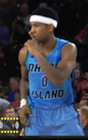
I've mentioned this for years that we need horns. A combination of the "RI" and ram would be preferable. VCU's logo is great precedence. Even now, I see our logo next to opponents logo's and it feels and looks like a cookie cutter shape. Colors are fantastic though.
0 x
GO RAMS
-
Rhodymob05
- Tyson Wheeler
- Posts: 7456
- Joined: 11 years ago
- Location: Rhode Island
- x 4018
Re: Logo
Messed around with the current logo and the former ram logo, something I hope to see one day.
- ram logo.jpg (25.92 KiB) Viewed 2270 times
2 x
GO RAMS
-
RhowdyRam02
- Frank Keaney
- Posts: 10367
- Joined: 11 years ago
- x 6629
Re: Logo
I'd like to see the top of the R/ram horn a little cleaner/less cluttered, but otherwise this is outstanding.
1 x
Take down the Robert Carothers banner and fix the concession stand lines
-
RhowdyRam02
- Frank Keaney
- Posts: 10367
- Joined: 11 years ago
- x 6629
Re: Logo
So the other thread reminded me of this idea for redoing the logo. I think if the horn was rotated a little bit so top of the R was just the horn I'd think you'd have a winner. You'd have the RI so we'd be instantly distinguishable from other teams with a ram mascot, and the old ram logo would live on in the newest logo.Rhodymob05 wrote:Messed around with the current logo and the former ram logo, something I hope to see one day.
ram logo.jpg
I would also have the I the same color as the bottom half of the R so that only the horn would be lighter blue, making it easier to tell that you're creating a horn design with the top of the R
1 x
Take down the Robert Carothers banner and fix the concession stand lines

Re: Logo
I want the RI and words RHODE ISLAND used more. It will better tie the URI athletics programs to the state and its residents. Think MICHIGAN. They hardly ever use the wolverine or the school's official name (University of Michigan). It is usually just MICHIGAN.
4 x
-
RhowdyRam02
- Frank Keaney
- Posts: 10367
- Joined: 11 years ago
- x 6629
Re: Logo
I totally agree, we should almost never use University of, just Rhode Island
1 x
Take down the Robert Carothers banner and fix the concession stand lines
-
Rhodymob05
- Tyson Wheeler
- Posts: 7456
- Joined: 11 years ago
- Location: Rhode Island
- x 4018
Re: Logo
I like the spelled out RI, bold and blue so it doesn't have any relation to RIC. I like two logos like in the other thread, but I also like VCUs combined Ram and words logo.
1 x
GO RAMS
-
RhowdyRam02
- Frank Keaney
- Posts: 10367
- Joined: 11 years ago
- x 6629
Re: Logo
Rhodymob05, I'm not sure if you still have this design, unfortunately it no longer shows up in this thread, but this was what I was getting at in the anchor branding threadRhowdyRam02 wrote: ↑6 years agoSo the other thread reminded me of this idea for redoing the logo. I think if the horn was rotated a little bit so top of the R was just the horn I'd think you'd have a winner. You'd have the RI so we'd be instantly distinguishable from other teams with a ram mascot, and the old ram logo would live on in the newest logo.Rhodymob05 wrote:Messed around with the current logo and the former ram logo, something I hope to see one day.
ram logo.jpg
I would also have the I the same color as the bottom half of the R so that only the horn would be lighter blue, making it easier to tell that you're creating a horn design with the top of the R
0 x
Take down the Robert Carothers banner and fix the concession stand lines
-
Rhodymob05
- Tyson Wheeler
- Posts: 7456
- Joined: 11 years ago
- Location: Rhode Island
- x 4018
Re: Logo
I'll try to find it.RhowdyRam02 wrote: ↑5 years agoRhodymob05, I'm not sure if you still have this design, unfortunately it no longer shows up in this thread, but this was what I was getting at in the anchor branding threadRhowdyRam02 wrote: ↑6 years agoSo the other thread reminded me of this idea for redoing the logo. I think if the horn was rotated a little bit so top of the R was just the horn I'd think you'd have a winner. You'd have the RI so we'd be instantly distinguishable from other teams with a ram mascot, and the old ram logo would live on in the newest logo.Rhodymob05 wrote:Messed around with the current logo and the former ram logo, something I hope to see one day.
ram logo.jpg
I would also have the I the same color as the bottom half of the R so that only the horn would be lighter blue, making it easier to tell that you're creating a horn design with the top of the R
0 x
GO RAMS
-
Rhodymob05
- Tyson Wheeler
- Posts: 7456
- Joined: 11 years ago
- Location: Rhode Island
- x 4018
Re: Logo
Heres that logo I put together. I just took the rams logo horns and placed it on an "RI". It would be cool for a real graphics designer to take this and run with it.
- Attachments
-
- ram logo.jpg (25.97 KiB) Viewed 1134 times
1 x
GO RAMS
-
RhowdyRam02
- Frank Keaney
- Posts: 10367
- Joined: 11 years ago
- x 6629
Re: Logo
I think if the horn was rotated a little bit so top of the R was just the horn I'd think you'd have a winner. You'd have the RI so we'd be instantly distinguishable from other teams with a ram mascot, and the old ram logo would live on in the newest logo.
I would also have the I the same color as the bottom half of the R so that only the horn would be lighter blue, making it easier to tell that you're creating a horn design with the top of the R
I would also have the I the same color as the bottom half of the R so that only the horn would be lighter blue, making it easier to tell that you're creating a horn design with the top of the R
1 x
Take down the Robert Carothers banner and fix the concession stand lines