
Our Logo
-
Rhodymob05
- Tyson Wheeler
- Posts: 7440
- Joined: 11 years ago
- Location: Rhode Island
- x 4004
Our Logo
Is anyone else slightly annoyed that the "rams" logo and recognition is nearly completely gone from marketing, jerseys and everything else? It doesn't make sense. It came to my attention last night looking at the LSU floor with the big tiger head on it. All we have is a mascot walking around. Its as if we are the URI Rhode Islanders. Bring the ram back! My dad got a sweater for Christmas and it has two logos, "URI" then the "RI" underneath, doesn't make sense. Maybe its just me.
0 x
GO RAMS

Re: Our Logo
The old Rams logo is terrible... looks like a skull.
Also, Rams does not distinguish us from a marketing perspective. There are other teams that are the Rams... TWO others in our conference (VCU and Fordham).
RI is where it's at!
Also, Rams does not distinguish us from a marketing perspective. There are other teams that are the Rams... TWO others in our conference (VCU and Fordham).
RI is where it's at!
0 x
-
Rhodymob05
- Tyson Wheeler
- Posts: 7440
- Joined: 11 years ago
- Location: Rhode Island
- x 4004
Re: Our Logo
create a new rams logo with keaney blue instead of a RI that looks like it was traced from a cookie cutter with a diagonal line through it. lol IT STINKS.
0 x
GO RAMS
Re: Our Logo
As someone with the old logo tattooed on them...im ok with the new one. Its better for marketing and awareness...and the old one will become like a pat patriot nostalgic thing down the road
0 x
If you say you’re a Rhody fan, I know you are my brother. For you have suffered as I have suffered.
Give to the Athletic Director's Fund
Give to Rhody's NIL
Give to the Athletic Director's Fund
Give to Rhody's NIL
-
section(105)
- Ernie Calverley
- Posts: 7728
- Joined: 11 years ago
- Location: narragansett
- x 4224
-
RhodyRams12

- Jimmy Baron
- Posts: 480
- Joined: 10 years ago
- Location: RI
- x 457
Re: Our Logo
I did not like the ram...i am much happier with this years logo and uniforms
0 x
Common sense is not common.
-
theblueram
- Frank Keaney
- Posts: 10499
- Joined: 11 years ago
- x 7614
-
section(105)
- Ernie Calverley
- Posts: 7728
- Joined: 11 years ago
- Location: narragansett
- x 4224
Re: Our Logo
Old Rhody vs. new/current Rhody? Don't care just get some juice going!!
0 x
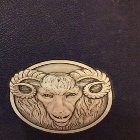
Ram logo via Grist 1938
-
bressler3south
- Carlton Owens
- Posts: 3108
- Joined: 11 years ago
- x 8
Re: Our Logo
This was suggested during the late-spring/early summer when the discussion was about the floor, marketing, etc., perpetrated by the RISD guy's sudden appearance -- and then -- sudden disappearance….section(105) wrote:Maybe Athletics needs a design a new logo contest?
0 x
Re: Our Logo
We've had this discussion before. It's about branding and I'm fine with it, but the Ram logo was one of the best in all of sports in my opinion (not sure where RhodyJay is coming from with the skull thing). I'd like to still see it used internally.
0 x
"If you build it, they will come." --Us, circa 2011
-
Rhodymob05
- Tyson Wheeler
- Posts: 7440
- Joined: 11 years ago
- Location: Rhode Island
- x 4004
Re: Our Logo
Its just repetative. And honestly you wouldn't have a clue to what our mascot is if you're from outta town. The old ram wasn't pretty but just redesign it. Market by mascot not MORE letters.
0 x
GO RAMS
-
bressler3south
- Carlton Owens
- Posts: 3108
- Joined: 11 years ago
- x 8
Re: Our Logo
Has anyone noticed the mascot never goes on the floor, not with the Cher team, not during promotional contests. Whats the reason for that?
0 x
"Every season, college basketball has one or two teams that rise from dormancy to relevancy, squads that make long-awaited charges at the NCAA Tournament and become really fun storylines along the way."
-
rodfromcranston

- Frank Keaney
- Posts: 13068
- Joined: 11 years ago
- x 1517
Re: Our Logo
I get the RI thing for marketing to the yahoos in North Dakota and
Wyoming.
Bring back the Ram on some place on that floor. It was a GREAT logo.
Also, get rid of that cartoon lion and bring back the Frank Lanning Rhody mascot.
I think he doesn't go on the floor, because he smells funky.
Maybe the Ramettes and cheerleaders don't like that?
Wyoming.
Bring back the Ram on some place on that floor. It was a GREAT logo.
Also, get rid of that cartoon lion and bring back the Frank Lanning Rhody mascot.
I think he doesn't go on the floor, because he smells funky.
Maybe the Ramettes and cheerleaders don't like that?
0 x
< Arthur is my spirit animal.
-
rambone 78
- Frank Keaney
- Posts: 16439
- Joined: 11 years ago
- x 5273
Re: Our Logo
I agree about the Ram logo. Bring it back in some form.
It's WAY better than the VCU or Fordham logo.
It's WAY better than the VCU or Fordham logo.
0 x

Re: Our Logo
Our uniforms are horrendous, small time in every way, looked like they were put together by a local print shop overnight. Can we get our players names on the uniforms please? looks very small time when you cant tell who the players are, there were countless times in the SMU, Arizona and LSU games where the annoucers were getting our players confused. I dont know, but it just seems small time in every way, we look minor league.
0 x
Re: Our Logo
I don't want to change the uniforms again. I don't mind them at all. Give it a few years, do we really need 3 uniform changes in 3 years?
0 x
-
Rhodymob05
- Tyson Wheeler
- Posts: 7440
- Joined: 11 years ago
- Location: Rhode Island
- x 4004
Re: Our Logo
the uniforms are fine, I actually love them, although I'm confused on blue tone, its different than the blue on the RI on the shorts
0 x
GO RAMS
Re: Our Logo
URI should have a contest/vote like the New Orleans Pelicans for a new mascot (or to keep the old)
0 x
URI BS '08 MS '11
NO LONGER waiting on my first NCAA appearance!
NO LONGER waiting on my first NCAA appearance!
Re: Our Logo
Seems like all teams that don't have really classic traditional uniforms change them every year when the apparel companies update their lines. I don't love or hate the current unis. Personally, I'd go back to our 1998 uniforms. That was our best team and our best uniforms.rhodyfan3 wrote:I don't want to change the uniforms again. I don't mind them at all. Give it a few years, do we really need 3 uniform changes in 3 years?
0 x
"If you build it, they will come." --Us, circa 2011
-
NJRhodyFan
- Jimmy Baron
- Posts: 387
- Joined: 11 years ago
- x 482
Re: Our Logo
Couldn't agree more...the '98 uniforms were the best. The lettering almost resembled Kansas...classic.TruePoint wrote:Seems like all teams that don't have really classic traditional uniforms change them every year when the apparel companies update their lines. I don't love or hate the current unis. Personally, I'd go back to our 1998 uniforms. That was our best team and our best uniforms.rhodyfan3 wrote:I don't want to change the uniforms again. I don't mind them at all. Give it a few years, do we really need 3 uniform changes in 3 years?
0 x
-
RhodyRams12
- Jimmy Baron
- Posts: 480
- Joined: 10 years ago
- Location: RI
- x 457
Re: Our Logo
This is sort of off topic but I have to say, I absolutely despise the pregame warmup pullovers that they wear.
0 x
Common sense is not common.
-
rodfromcranston
- Frank Keaney
- Posts: 13068
- Joined: 11 years ago
- x 1517
Re: Our Logo
Has anyone seen the weird gray warmups that the players wear?
When did we become Georgetown?
Did anyone notice the ugly unis UMass had on when they played PC?
Hideous gray and red things. They let PC wear home white. Odd.
When did we become Georgetown?
Did anyone notice the ugly unis UMass had on when they played PC?
Hideous gray and red things. They let PC wear home white. Odd.
0 x
< Arthur is my spirit animal.
Re: Our Logo
I really don't like the road unis. I would really like to see the '98 unis again. Looked sharp. Also want the ram logo again, not RI.
0 x
-
rodfromcranston
- Frank Keaney
- Posts: 13068
- Joined: 11 years ago
- x 1517
Re: Our Logo
Is it me, or can you guys read the road numbers?
When the game isn't being called by the announcers,
it's hard to tell who is who. Our guards are all about the same
size and build. I could tell TJ, because he wore a sleeve.
When the game isn't being called by the announcers,
it's hard to tell who is who. Our guards are all about the same
size and build. I could tell TJ, because he wore a sleeve.
0 x
< Arthur is my spirit animal.
Re: Our Logo
bressler3south wrote:This was suggested during the late-spring/early summer when the discussion was about the floor, marketing, etc., perpetrated by the RISD guy's sudden appearance -- and then -- sudden disappearance….section(105) wrote:Maybe Athletics needs a design a new logo contest?

Heh... yeah, I'm that RISD guy... I still browse this message board, but haven't posted in a while cuz I wasn't feelin the love on this board and felt like I was butting in...
I think I had a half dozen recommendations, and got a pat on the head from posters, and then someone pointed to the door for me to leave...
Good game Saturday, things are looking up...!
0 x
-
section(105)
- Ernie Calverley
- Posts: 7728
- Joined: 11 years ago
- Location: narragansett
- x 4224
Re: Our Logo
I don't give a crap what the unis look like, at this point I only want the winner within....
0 x
Ram logo via Grist 1938
-
theblueram
- Frank Keaney
- Posts: 10499
- Joined: 11 years ago
- x 7614
Re: Our Logo
I think someone finally told him he is not a Ram, but some cartoon lion. Now he has identity issues.Iggy1979 wrote:Has anyone noticed the mascot never goes on the floor, not with the Cher team, not during promotional contests. Whats the reason for that?
0 x
-
Cameron_Dollar
- Lamar Odom
- Posts: 337
- Joined: 11 years ago
- x 341
Re: Our Logo
You may not care but recruits do. When they are visiting, I'm sure they envision themselves in the uniform of the team of which they are visiting. There are some really nice uniforms out there, even worn by some of the smaller schools. I think an opportunity was squandered this year. Thorr gave Dan the keys to the program. He could have opted for a little more style. As for the names on the back of the uniform; when Indiana omits them it's a statement. When smaller schools omit the name, it looks small time. At the risk of being called a troll again, I think UMASS' grey alternate uniform that they wore against PC were terrific. Those alternate uniforms are often raffled off at the end of the season and can more than pay for themselves.section(105) wrote:I don't give a crap what the unis look like, at this point I only want the winner within....
0 x
-
Seawrightspostgame

- Sly Williams
- Posts: 4140
- Joined: 11 years ago
- x 1563
Re: Our Logo
"Anchor down" Vanderbilt. I think Arizona has a huge anchor outside the football stadium. All our academic buildings have an anchor on them.
They use RI because they want to represent the state. Ppl like PC because the name is providence and most ppl in RI live in and around it.
I hope they continue the RI but adding an anchor element to our whole thing wouldn't hurt. Keep the ram.
Auburn has the tiger. War eagle. And Bo Jackson. We can have a few things going on at one time. It's ok.
0 x
I want to change my name to BlockIslandFerry
-
Rhodymob05
- Tyson Wheeler
- Posts: 7440
- Joined: 11 years ago
- Location: Rhode Island
- x 4004
Re: Our Logo
I just want to see the ram included more somewhere somehow I don't care how or where
0 x
GO RAMS
-
twisted3829

- Carlton Owens
- Posts: 3276
- Joined: 11 years ago
- x 439
Re: Our Logo
+1000Cameron_Dollar wrote:You may not care but recruits do. When they are visiting, I'm sure they envision themselves in the uniform of the team of which they are visiting. There are some really nice uniforms out there, even worn by some of the smaller schools. I think an opportunity was squandered this year. Thorr gave Dan the keys to the program. He could have opted for a little more style. As for the names on the back of the uniform; when Indiana omits them it's a statement. When smaller schools omit the name, it looks small time. At the risk of being called a troll again, I think UMASS' grey alternate uniform that they wore against PC were terrific. Those alternate uniforms are often raffled off at the end of the season and can more than pay for themselves.section(105) wrote:I don't give a crap what the unis look like, at this point I only want the winner within....
I loved the alternate UMass uniform used for the pc game. I also like pc's grey look as well. Couldnt agree more with no player names on the jerseys also. Small time, we are not Notre Dame, Penn State (pre 2012), Indiana or UConn women.. PUT THE PLAYERS NAMES ON THE JERSEYS, its not lost on the recruits either, dont think they notice the gear of the schools recruiting them.
0 x
-
rambone 78
- Frank Keaney
- Posts: 16439
- Joined: 11 years ago
- x 5273
Re: Our Logo
OK ranto"ram"a time
Don't like the lettering on the current unis....I want "Rams" written in script on the home unis. No player names on the whites. Numbers below the "Rams" script.
On the road I want old school RHODE ISLAND block letters, number in the middle. Player names on the back (road unis only) I also wouldn't mind seeing the Harrick era navy road unis as an alternate. Those were super cool IMHO.
I also like the Ram, small logo somewhere on the floor (once is fine) and on the pants both home and away unis, located lower near the knee area.
There fixed it.
Next!!
0 x
We're gonna run the picket fence at "em.....now boys don't get caught watchin' the paint dry!
Re: Our Logo
Incorporating a cool "anchor" somewhere would be ok with me too but our friends at RIC might not want their logo on our floor or unis....just sayin'..............
BTW did they just loose to Johnson and Wales? How does that happen???
BTW did they just loose to Johnson and Wales? How does that happen???
0 x
We're gonna run the picket fence at "em.....now boys don't get caught watchin' the paint dry!
-
Rhodymob05
- Tyson Wheeler
- Posts: 7440
- Joined: 11 years ago
- Location: Rhode Island
- x 4004
-
Rhode_Island_Red

- Carlton Owens
- Posts: 2745
- Joined: 11 years ago
- x 2602
Re: Our Logo
While we're on the topic of uniforms etc., can we please get the Ramettes to dress like Ramettes?
0 x
Proudly supplying the Internet with online wisecracks, impertinent comments and loathing of all things mental hospital since 1996.
-
Rhodymob05
- Tyson Wheeler
- Posts: 7440
- Joined: 11 years ago
- Location: Rhode Island
- x 4004

Re: Our Logo
rambone 78 wrote:I agree about the Ram logo. Bring it back in some form.
It's WAY better than the VCU or Fordham logo.
I vote for the Ram Logo to come back, I loved the logo on the old floor, love on hats, but it is hard to find a Navy hat with a Bright Rhody blue Logo on the front. Nothing is wrong with the logo.
0 x
Re: Our Logo
I am a HUGE fan of the ram logo, and agree that it should remain a part of the program in some capacity, though I totally get the move towards the RI for branding purposes.
I love the design of the ram, and agree that it is far superior to any other ram logo out there (those often seem too cartoonish)
I love the design of the ram, and agree that it is far superior to any other ram logo out there (those often seem too cartoonish)
0 x

Re: Our Logo
I have no problem with the Ram being used for the athletic teams. I however strongly feel that the name RHODE ISLAND should be the most prominently used moniker for branding purposes. I would try to discourage formally using the acronym URI as some are not familiar with what it stands for (more outside the state).
I would like RHODE ISLAND to became like MICHIGAN for the Universtiy of Michigan Wolverines. Most all merchandise for their athletic teams primarily employ MICHIGAN. I feel that this practice helps bond the school with the state and would hope that something like that might occur in RI.
I would like RHODE ISLAND to became like MICHIGAN for the Universtiy of Michigan Wolverines. Most all merchandise for their athletic teams primarily employ MICHIGAN. I feel that this practice helps bond the school with the state and would hope that something like that might occur in RI.
0 x
Re: Our Logo
If URI ever gets back to national prominence, they should drop the "I" in the logo.
Just like Michigan "M" and Arizona "A" the logo should just be a big, fat, in your face "R".
There is no other state out of 50 that starts with R so there should be no problem.
Anyone too stupid to figure out the full name of Rhode Island... that's their problem, because giving them the second letter probably isn't going to help them much.
0 x
Re: Our Logo
Michigan is just "M" because its name is only one word and it starts with an "M". Rhode Island is two words, hence "RI".
0 x
"If you build it, they will come." --Us, circa 2011
Re: Our Logo
Why not RIAPP then?
It's actually five words.
I say, anything after the R is overkill. It's like the 1 digit license plate. It belongs to us, let's claim it.
It's actually five words.
I say, anything after the R is overkill. It's like the 1 digit license plate. It belongs to us, let's claim it.
0 x
Re: Our Logo
If you went to the DMV, and you could have "R" or "RI", which one would you choose?
If you could have "1" or "11" which one would you choose?
Why let some loser team like Richmond have the "R" when we have first dibs?
If you could have "1" or "11" which one would you choose?
Why let some loser team like Richmond have the "R" when we have first dibs?
0 x
Re: Our Logo
I don't get either of your points here, but we are RI. RI = Rhode Island. R = Rhode? No thanks. I'd always prefer to be "RI" to "R".
0 x
"If you build it, they will come." --Us, circa 2011
Re: Our Logo
The logo looks stupid. It's a deformed R with a smaller I in it. We already are Rhode Island, you don't have to stick with a weak logo to prove it. That's the point.
Having a R all alone is like sticking your balls in someone's face, just because you can.
Having a R all alone is like sticking your balls in someone's face, just because you can.
0 x
Re: Our Logo
No it isn't. I don't get why you think that. It makes no sense.
0 x
"If you build it, they will come." --Us, circa 2011