
Well this is what all of us have wanted, an official branding guide:
https://s3.amazonaws.com/gorhody.com/do ... _Guide.pdf
Cool grey and black have been added as secondary colors for athletics, to complement our primary colors of Keaney blue, navy, and white (really wish gold to match the University as a whole, and feel black and grey are overused, but it's official now).
Our new official font, to be utilized primarily anytime "Rhode Island" is utilized on uniforms and branding projects, is called Rhody Bold, and is designed to mirror our primary interlocking RI logo. We have two secondary fonts, Eurostile and Blackhawk, for other athletics uses.
Interlocking RI remains the primary logo.
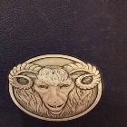
Rams Head is secondary logo. Looking at page 8, it's absolutely clear how superior the new ram is to the old one. If you attach sentimental value to the old one, fine, that's valid, but the new one as a logo is objectively better.
The anchor is now moved down to the tertiary logo and it's been changed to more closely resemble the anchor in the URI and state seal. The change in the anchor is a welcome one for me.
I'd have to think with these changes we might see a host of new uniforms starting with the fall teams
New Ram logo?
-
RhowdyRam02

- Frank Keaney
- Posts: 10392
- Joined: 11 years ago
- x 6660
Re: New Ram logo?
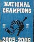
Take down the Robert Carothers banner and fix the concession stand lines
-
RhowdyRam02
- Frank Keaney
- Posts: 10392
- Joined: 11 years ago
- x 6660
Re: New Ram logo?
And the anchor on these uniforms isn't our actual anchor logo
Take down the Robert Carothers banner and fix the concession stand lines
-
RhowdyRam02
- Frank Keaney
- Posts: 10392
- Joined: 11 years ago
- x 6660
Re: New Ram logo?
We've already been using the Blackhawk font for a while now, mostly surrounding the Rhody Ruckus
Take down the Robert Carothers banner and fix the concession stand lines
-
Rhodymob05

- Tyson Wheeler
- Posts: 7473
- Joined: 11 years ago
- Location: Rhode Island
- x 4034
Re: New Ram logo?
Actually not bad. I like the realistic Ram. I was afraid it would be a cartoon but it’s not bad
GO RAMS
-
ElmCityRhody

- Sly Williams
- Posts: 4623
- Joined: 11 years ago
- x 2483
Re: New Ram logo?
I like the main font - that’s fine
Why do silver and black ?
That’s Cracker Jack pc colors
And that 2ndary font is Cartoon Network
Why do silver and black ?
That’s Cracker Jack pc colors
And that 2ndary font is Cartoon Network
-
Rhodymob05
- Tyson Wheeler
- Posts: 7473
- Joined: 11 years ago
- Location: Rhode Island
- x 4034
-
rhodysurf

- Cuttino Mobley
- Posts: 1527
- Joined: 9 years ago
- Location: The Pier
- x 1714
Re: New Ram logo?
I hate it. The old one is monochrome and you can actually print it on things in any of the brand colors. This has depth and just way too much going on. I don’t want this on anything I own
-
Rhodymob05
- Tyson Wheeler
- Posts: 7473
- Joined: 11 years ago
- Location: Rhode Island
- x 4034
-
TruePoint

- Frank Keaney
- Posts: 13856
- Joined: 11 years ago
- x 11439
Re: New Ram logo?
Everyone is entitled to their own opinion about this stuff but I feel completely the opposite. This thing looks like generic corporate trash to me, overthought and overcooked. I want stuff like this to be as clean and understated as possible. The old logo looks like it had been around since the beginning of the school (even though it actually hadn’t). The only thing a logo can possibly be good for, in my opinion, being a stand-in for tradition. If it is new it sucks by definition, because it doesn’t imbue a sense of tradition. Logos should be permanent, and therefore if your team or school has been around for a long time, your logo should look like it’s been around for a long time.RhowdyRam02 wrote: ↑2 years ago
Rams Head is secondary logo. Looking at page 8, it's absolutely clear how superior the new ram is to the old one. If you attach sentimental value to the old one, fine, that's valid, but the new one as a logo is objectively better.
"If you build it, they will come." --Us, circa 2011
-
Blue Man

- Ernie Calverley
- Posts: 7510
- Joined: 11 years ago
- x 15364
Re: New Ram logo?
Compare ours to VCU’s. Far superior. Ugh everything sucks.
New coach has a tip to tail rebuild. Maybe UConn wants to go in a different direction!?
New coach has a tip to tail rebuild. Maybe UConn wants to go in a different direction!?
You do not have the required permissions to view the files attached to this post.
If you say you’re a Rhody fan, I know you are my brother. For you have suffered as I have suffered.
Give to the Athletic Director's Fund
Give to Rhody's NIL
Give to the Athletic Director's Fund
Give to Rhody's NIL
-
TruePoint
- Frank Keaney
- Posts: 13856
- Joined: 11 years ago
- x 11439
Re: New Ram logo?
Fwiw I think VCU’s branding is god awful also. We have an unfair advantage with the color palate because it’s very hard to conceive of anything with the VCU colors looking good. But their depictions of a Ram are also too busy and modern.
"If you build it, they will come." --Us, circa 2011
-
Taylor Swift
- Carlton Owens
- Posts: 3243
- Joined: 10 years ago
- Location: Narragansett
- x 2518
Re: New Ram logo?
Why do they always take the cheap route with this and approve the most half-assed thing? Who approved that barf-inducing ram logo? Stick with the interlocked RI. I have a few shirts and sweatshirts with the old Ram on it. Much better IMHO.
-
RhowdyRam02
- Frank Keaney
- Posts: 10392
- Joined: 11 years ago
- x 6660
Re: New Ram logo?
They look like Buffalo Wild Wings is their sponsor
Take down the Robert Carothers banner and fix the concession stand lines
-
Blue Man
- Ernie Calverley
- Posts: 7510
- Joined: 11 years ago
- x 15364
Re: New Ram logo?
I didn’t say great. Just far superior to ours.
I love our old logo. Don’t see a need to do this rebrand when we didn’t even use that logo in the first place.
If you say you’re a Rhody fan, I know you are my brother. For you have suffered as I have suffered.
Give to the Athletic Director's Fund
Give to Rhody's NIL
Give to the Athletic Director's Fund
Give to Rhody's NIL
-
Taylor Swift
- Carlton Owens
- Posts: 3243
- Joined: 10 years ago
- Location: Narragansett
- x 2518
Re: New Ram logo?
-
rambone 78
- Frank Keaney
- Posts: 16453
- Joined: 11 years ago
- x 5280
Re: New Ram logo?
Both URI's and VCU's branding sucks imo.
-
PeteRI

- Sly Williams
- Posts: 4379
- Joined: 9 years ago
- x 3700
Re: New Ram logo?
Apparently we're getting the branding we deserve right now.
-
rambone 78
- Frank Keaney
- Posts: 16453
- Joined: 11 years ago
- x 5280
Re: New Ram logo?
Shitty branding, shitty program.
Laughingstock.
Laughingstock.
-
NC_Ram
- Steve Chubin
- Posts: 131
- Joined: 5 years ago
- x 195
Re: New Ram logo?
The anchor is a nice representation of the one currently around this program's neck.
-
rambone 78
- Frank Keaney
- Posts: 16453
- Joined: 11 years ago
- x 5280
Re: New Ram logo?
And to imagine this bunch is still over .500.....not for much longer though.
-
Sweep The Leg

- Tom Garrick
- Posts: 1114
- Joined: 11 years ago
- Location: Maynard, MA
- x 711
-
Rhody_NYCT

- Jimmy Baron
- Posts: 469
- Joined: 6 years ago
- x 554
Re: New Ram logo?
Retire the new Jersey. Not good.
-
Rhodymob05
- Tyson Wheeler
- Posts: 7473
- Joined: 11 years ago
- Location: Rhode Island
- x 4034
Re: New Ram logo?
VCU has a nice ram/letter combo. Looks legit. The more I see our new one the more I think D111 school.
GO RAMS
-
Puck Frovidence
- ARD
- Posts: 523
- Joined: 10 years ago
- x 549
Re: New Ram logo?
Passed on the game for the first time in a long time today, so I just saw this and the new logo. Honestly it comes to a point where this level of effort is just insulting.
It looks like a generic High School logo that the student advisor picked out of the tshirt company's catalog.
It looks like a generic High School logo that the student advisor picked out of the tshirt company's catalog.

-
Taylor Swift
- Carlton Owens
- Posts: 3243
- Joined: 10 years ago
- Location: Narragansett
- x 2518
Re: New Ram logo?
Lmfao!!! In 6th grade I came in second place to design a mascot for Narragansett Pier School. I said the Schooners and did a really cool looking boat with a pirate flag. My effort was better!!!Puck Frovidence wrote: ↑2 years ago Passed on the game for the first time in a long time today, so I just saw this and the new logo. Honestly it comes to a point where this level of effort is just insulting.
It looks like a generic High School logo that the student advisor picked out of the tshirt company's catalog.
-
rhodyrudder

- Cuttino Mobley
- Posts: 1832
- Joined: 11 years ago
- x 1048
Re: New Ram logo?
It’s the CSU logo with a hint of blue.
Are we still in Rhode Island, Toto?
Are we still in Rhode Island, Toto?
-
phipsiGD'11
- Art Stephenson
- Posts: 768
- Joined: 6 years ago
- x 844
Re: New Ram logo?
Can someone post the ram logo from the 2000s. My wife and I are trying to remember what it looked like and I am not rummaging through the old clothes bins in the basement to try and find a shirt.
-
Rhodymob05
- Tyson Wheeler
- Posts: 7473
- Joined: 11 years ago
- Location: Rhode Island
- x 4034
Re: New Ram logo?
You do not have the required permissions to view the files attached to this post.
GO RAMS
-
Rhody72
- Carlton Owens
- Posts: 2453
- Joined: 11 years ago
- x 763
Re: New Ram logo?
It was designed by a committee and acceptable to a variety of agendas for political correctness and serves no useful purpose which makes it a truly great academic exercise. Just like the bricks for each new university building.TruePoint wrote: ↑2 years ago
Everyone is entitled to their own opinion about this stuff but I feel completely the opposite. This thing looks like generic corporate trash to me, overthought and overcooked. I want stuff like this to be as clean and understated as possible. The old logo looks like it had been around since the beginning of the school (even though it actually hadn’t). The only thing a logo can possibly be good for, in my opinion, being a stand-in for tradition. If it is new it sucks by definition, because it doesn’t imbue a sense of tradition. Logos should be permanent, and therefore if your team or school has been around for a long time, your logo should look like it’s been around for a long time.
NCAAs or Bust!
-
KingstonLane
- Cuttino Mobley
- Posts: 1590
- Joined: 3 years ago
- x 1656
Re: New Ram logo?
1) Looks like a clip art logo/default video game logo
2) More specifically looks like Colorado States logo with our colors
3) Old logo also looks like shit (in my opinion). Thought it was a snail with a face before I enrolled at URI
4) Winning > logos
2) More specifically looks like Colorado States logo with our colors
3) Old logo also looks like shit (in my opinion). Thought it was a snail with a face before I enrolled at URI
4) Winning > logos
-
Rhody15
- Ernie Calverley
- Posts: 7790
- Joined: 11 years ago
- Location: Rhode Island
- x 6572
Re: New Ram logo?
If we were winning, the majority of us would like the logo.
I actually like it.
Just Wish it had “Rhode Island” fit in on the top or bottom of the logo.
I actually like it.
Just Wish it had “Rhode Island” fit in on the top or bottom of the logo.
Go Rhody
-
phipsiGD'11
- Art Stephenson
- Posts: 768
- Joined: 6 years ago
- x 844
Re: New Ram logo?
That Ram logo could be any team, anywhere. It actually looks like the RAM truck logo with different shading.
It never ceases to amaze me how URI always manages to be laughably underwhelming in everything we do.
It never ceases to amaze me how URI always manages to be laughably underwhelming in everything we do.
-
Taylor Swift
- Carlton Owens
- Posts: 3243
- Joined: 10 years ago
- Location: Narragansett
- x 2518
Re: New Ram logo?
The logo doesn't do itself any justice. It doesn't distinguish itself. Stick to the interlocking RI. I'm so over such parochial BS URI keeps producing.
-
Rhodymob05
- Tyson Wheeler
- Posts: 7473
- Joined: 11 years ago
- Location: Rhode Island
- x 4034
Re: New Ram logo?
#1 and #2 are spot on.KingstonLane wrote: ↑2 years ago 1) Looks like a clip art logo/default video game logo
2) More specifically looks like Colorado States logo with our colors
3) Old logo also looks like shit (in my opinion). Thought it was a snail with a face before I enrolled at URI
4) Winning > logos
GO RAMS
-
The Dude

- Tom Garrick
- Posts: 1074
- Joined: 11 years ago
- x 741
Re: New Ram logo?
Who designs these things? Elementary School children? I'm disappointed. Even the anchor logo looks sad. 
Whatever, it's just comical at this point. Go Rhody?

Whatever, it's just comical at this point.
"Emancipate yourselves from mental slavery, none but ourselves can free our minds!" - Marcus Garvey
-
Taylor Swift
- Carlton Owens
- Posts: 3243
- Joined: 10 years ago
- Location: Narragansett
- x 2518
Re: New Ram logo?
I sincerely want to know..... Is there someone employed by the university who came up with this as a great idea of flat face Ram? Did they put it out to bid and have a 3rd party develop it? It's simply embarrassing (a theme here!?!!)
As much as I enjoy comedy and standup, my mind can't take this level of madness.
As much as I enjoy comedy and standup, my mind can't take this level of madness.
-
RhodyFanNotAlum
- Kenny Green
- Posts: 219
- Joined: 5 years ago
- Location: Monroe, CT
- x 360
Re: New Ram logo?
embaRAMsing
-
NYGFan_Section208

- Frank Keaney
- Posts: 12549
- Joined: 8 years ago
- x 6785
-
Rhodymob05
- Tyson Wheeler
- Posts: 7473
- Joined: 11 years ago
- Location: Rhode Island
- x 4034
Re: New Ram logo?
I just did a quick internet search of "ram logos" and I hate our new one even more. And its already slapped on shirts and cups and stickers, I guess there's no turning back now. F*ck,
GO RAMS
-
RhowdyRam02
- Frank Keaney
- Posts: 10392
- Joined: 11 years ago
- x 6660
Re: New Ram logo?
I get that I'm in the minority on the logo. That's fine. But at least the other people said something that makes sense even if I disagree. I've read this word jumble multiple times, and at no point does it make any sense. Political correctness? Academic exercise? Your whole last sentence?Rhody72 wrote: ↑2 years agoIt was designed by a committee and acceptable to a variety of agendas for political correctness and serves no useful purpose which makes it a truly great academic exercise. Just like the bricks for each new university building.TruePoint wrote: ↑2 years ago
Everyone is entitled to their own opinion about this stuff but I feel completely the opposite. This thing looks like generic corporate trash to me, overthought and overcooked. I want stuff like this to be as clean and understated as possible. The old logo looks like it had been around since the beginning of the school (even though it actually hadn’t). The only thing a logo can possibly be good for, in my opinion, being a stand-in for tradition. If it is new it sucks by definition, because it doesn’t imbue a sense of tradition. Logos should be permanent, and therefore if your team or school has been around for a long time, your logo should look like it’s been around for a long time.
Take down the Robert Carothers banner and fix the concession stand lines
-
section(105)
- Ernie Calverley
- Posts: 7832
- Joined: 11 years ago
- Location: narragansett
- x 4299
Re: New Ram logo?
……while we are beating up, mostly, on this…..let’s bring back the old Ram mascot suit…..ya know the one that left the RC during a game break, and then enter the current one……ya know the old one that decapitated the Hawk…….and an injection of personality would be helpful……
Ram logo via Grist 1938
-
Spook
- Abdul Fox
- Posts: 35
- Joined: 11 years ago
- x 20
Re: New Ram logo?
At this point we should be using the ass of a Ram instead of the face
-
Rhody72
- Carlton Owens
- Posts: 2453
- Joined: 11 years ago
- x 763
Re: New Ram logo?
You get it! The process makes NO SENSE. As for the brick reference, it use to be a URI campus joke that a new standard color/shade for bricks would be established for each new building.RhowdyRam02 wrote: ↑2 years agoI get that I'm in the minority on the logo. That's fine. But at least the other people said something that makes sense even if I disagree. I've read this word jumble multiple times, and at no point does it make any sense. Political correctness? Academic exercise? Your whole last sentence?
NCAAs or Bust!
-
PeterRamTime
- Frank Keaney
- Posts: 10067
- Joined: 9 years ago
- x 5900
Re: New Ram logo?
Yes what I was saying! Looks like every Ram logo ever except our unique one!Rhodymob05 wrote: ↑2 years ago I just did a quick internet search of "ram logos" and I hate our new one even more. And its already slapped on shirts and cups and stickers, I guess there's no turning back now. F*ck,
The old one is perfect for its uniqueness and because the "Rams" aspect of our name is the least important. We as fans never say "dang the Rams need a new coach etc" Rams is not a prominent aspect of our identity. That's why the abstract Ram was so right for us.
-
rhodyrudder
- Cuttino Mobley
- Posts: 1832
- Joined: 11 years ago
- x 1048
Re: New Ram logo?
Wtf r u talking about?PeterRamTime wrote: ↑2 years agoYes what I was saying! Looks like every Ram logo ever except our unique one!Rhodymob05 wrote: ↑2 years ago I just did a quick internet search of "ram logos" and I hate our new one even more. And its already slapped on shirts and cups and stickers, I guess there's no turning back now. F*ck,
The old one is perfect for its uniqueness and because the "Rams" aspect of our name is the least important. We as fans never say "dang the Rams need a new coach etc" Rams is not a prominent aspect of our identity. That's why the abstract Ram was so right for us.
-
Rhody15
- Ernie Calverley
- Posts: 7790
- Joined: 11 years ago
- Location: Rhode Island
- x 6572
Re: New Ram logo?
The name of our school is literally the Rhode Island Rams.PeterRamTime wrote: ↑2 years agoYes what I was saying! Looks like every Ram logo ever except our unique one!Rhodymob05 wrote: ↑2 years ago I just did a quick internet search of "ram logos" and I hate our new one even more. And its already slapped on shirts and cups and stickers, I guess there's no turning back now. F*ck,
The old one is perfect for its uniqueness and because the "Rams" aspect of our name is the least important. We as fans never say "dang the Rams need a new coach etc" Rams is not a prominent aspect of our identity. That's why the abstract Ram was so right for us.
Go Rhody
-
steviep123

- Sly Williams
- Posts: 4843
- Joined: 11 years ago
- x 3147
Re: New Ram logo?
This is my favorite logo scheme. I didn't like switching to the interlocking bi color RI at first, but it grew on me, and now I like it. However, both logos are worlds better than this new (thankfully secondary) logo! Either keep the interlocking RI or switch back to this pictured ram.
Bleed Keaney Blue!
”I'm not coming there to be in the top 3 of the Atlantic 10. I'm coming to win the damn thing!”
”I'm not coming there to be in the top 3 of the Atlantic 10. I'm coming to win the damn thing!”
-
Billyboy78
- Frank Keaney
- Posts: 16839
- Joined: 11 years ago
- x 8998
Re: New Ram logo?
"RHODY!RHODY!RHODY!"........."DUCKS! DUCKS! DUCKS!"Rhody15 wrote: ↑2 years agoThe name of our school is literally the Rhode Island Rams.PeterRamTime wrote: ↑2 years agoYes what I was saying! Looks like every Ram logo ever except our unique one!Rhodymob05 wrote: ↑2 years ago I just did a quick internet search of "ram logos" and I hate our new one even more. And its already slapped on shirts and cups and stickers, I guess there's no turning back now. F*ck,
The old one is perfect for its uniqueness and because the "Rams" aspect of our name is the least important. We as fans never say "dang the Rams need a new coach etc" Rams is not a prominent aspect of our identity. That's why the abstract Ram was so right for us.
-
PeterRamTime
- Frank Keaney
- Posts: 10067
- Joined: 9 years ago
- x 5900
Re: New Ram logo?
Yeah you just can't wrap your head around what I'm saying.Rhody15 wrote: ↑2 years agoThe name of our school is literally the Rhode Island Rams.PeterRamTime wrote: ↑2 years agoYes what I was saying! Looks like every Ram logo ever except our unique one!Rhodymob05 wrote: ↑2 years ago I just did a quick internet search of "ram logos" and I hate our new one even more. And its already slapped on shirts and cups and stickers, I guess there's no turning back now. F*ck,
The old one is perfect for its uniqueness and because the "Rams" aspect of our name is the least important. We as fans never say "dang the Rams need a new coach etc" Rams is not a prominent aspect of our identity. That's why the abstract Ram was so right for us.